Health & Medicine (English)
Short version from the presentation: The pandemic in raw data – by Marcel Barz
24.02.2022
Subtitle "Afrikaans" was produced by machine.Subtitle "አማርኛ" was produced by machine.Subtitle "العربية " was produced by machine.Subtitle "Ārāmāyâ" was produced by machine.Subtitle "azərbaycan dili " was produced by machine.Subtitle "беларуская мова " was produced by machine.Подзаглавието "България" е създадено от машина.সাবটাইটেল "বাংলা " মেশিন দ্বারা তৈরি করা হয়েছিল।Subtitle "བོད་ཡིག" was produced by machine.Subtitle "босански" was produced by machine.Subtitle "català" was produced by machine.Subtitle "Cebuano" was produced by machine.Subtitle "ગુજરાતી" was produced by machine.Subtitle "corsu" was produced by machine.Podtitul "Čeština" byl vytvořen automaticky.Subtitle "Cymraeg" was produced by machine.Subtitle "Dansk" was produced by machine.Untertitel "Deutsch" wurde maschinell erzeugt.Subtitle "Untertitel" was produced by machine.Ο υπότιτλος "Ελληνικά" δημιουργήθηκε αυτόματα.Subtitle "English" was produced by machine.Subtitle "Esperanto" was produced by machine.El subtítulo "Español" se generó automáticamente.Subtitle "Eesti" was produced by machine.Subtitle "euskara" was produced by machine.Subtitle "فارسی" was produced by machine.Subtitle "Suomi" was produced by machine.Le sous-titrage "Français" a été généré automatiquement.Subtitle "Frysk" was produced by machine.Subtitle "Gaeilge" was produced by machine.Subtitle "Gàidhlig" was produced by machine.Subtitle "Galego" was produced by machine.Subtitle "Schwizerdütsch" was produced by machine.Subtitle "هَوُسَ" was produced by machine.Subtitle "Ōlelo Hawaiʻi" was produced by machine.Subtitle "עברית" was produced by machine.Subtitle "हिन्दी" was produced by machine.Subtitle "Mẹo" was produced by machine.Podnaslov "Hrvatski" generiran je automatski.Subtitle "Kreyòl ayisyen " was produced by machine.Subtitle "Magyar" was produced by machine.Subtitle "Հայերեն" was produced by machine.Subtitle "Bahasa Indonesia " was produced by machine.Subtitle "Asụsụ Igbo " was produced by machine.Textun"Íslenska" var framkvæmt vélrænt.Sottotitoli "Italiano" sono stati generati con l'intelligenza artificiale.字幕は"日本語" 自動的に生成されました。Subtitle "Basa Jawa" was produced by machine.Subtitle "ქართული" was produced by machine.Subtitle "қазақ тілі " was produced by machine.Subtitle "ភាសាខ្មែរ" was produced by machine.Subtitle "ಕನ್ನಡ" was produced by machine.Subtitle "한국어" was produced by machine.Subtitle "कोंकणी語" was produced by machine.Subtitle "کوردی" was produced by machine.Subtitle "Кыргызча" was produced by machine.Subtitle " lingua latina" was produced by machine.Subtitle "Lëtzebuergesch" was produced by machine.Subtitle "Lingala" was produced by machine.Subtitle "ພາສາ" was produced by machine.Antraštė "Lietuvių" buvo sukurta mašina.Subtitle "Latviešu" was produced by machine.Subtitle "fiteny malagasy" was produced by machine.Subtitle "te reo Māori" was produced by machine.Subtitle "македонски јазик" was produced by machine.Subtitle "malayāḷaṁ" was produced by machine.Subtitle "Монгол хэл" was produced by machine.Subtitle "मराठी" was produced by machine.Subtitle "Bahasa Malaysia" was produced by machine.Subtitle "Malti" was produced by machine.Subtitle "မြန်မာစာ " was produced by machine.Subtitle "नेपाली" was produced by machine.Ondertitels "Nederlands" machinaal geproduceerd.Subtitle "Norsk" was produced by machine.Subtitle "chiCheŵa" was produced by machine.Subtitle "ਪੰਜਾਬੀ" was produced by machine.Podtytuł "Polska" został utworzony przez maszynę.Subtitle "پښتو" was produced by machine.Legenda "Português" foi gerada automaticamente.Subtitle "Română" was produced by machine.Subtitle "Язык жестов (Русский)" was produced by machine.Субтитры "Pусский" были созданы машиной.Subtitle "Kinyarwanda" was produced by machine.Subtitle "सिन्धी" was produced by machine.Subtitle "Deutschschweizer Gebärdensprache" was produced by machine.Subtitle "සිංහල" was produced by machine.Subtitle "Slovensky" was produced by machine.Subtitle "Slovenski" was produced by machine.Subtitle "gagana fa'a Samoa" was produced by machine.Subtitle "chiShona" was produced by machine.Subtitle "Soomaaliga" was produced by machine.Titra "Shqip" u krijua automatikisht.Превод "србски" је урађен машински.Subtitle "Sesotho" was produced by machine.Subtitle "Basa Sunda" was produced by machine.Undertext "Svenska" är maskinell skapad.Subtitle "Kiswahili" was produced by machine.Subtitle "தமிழ்" was produced by machine.Subtitle "తెలుగు" was produced by machine.Subtitle "Тоҷикй" was produced by machine.Subtitle "ภาษาไทย" was produced by machine.ንኡስ ኣርእስቲ "ትግርኛ" ብማሽን እዩ ተፈሪዩ።Subtitle "Türkmençe" was produced by machine.Subtitle "Tagalog" ay nabuo sa pamamagitan ng makina.Altyazı "Türkçe" otomatik olarak oluşturuldu.Subtitle "татар теле" was produced by machine.Subtitle "Українська " was produced by machine.ذیلی عنوان "اردو" مشین کے ذریعہ تیار کیا گیا تھا۔Subtitle "Oʻzbek" was produced by machine.Phụ đề được tạo bởi máy.Subtitle "Serbšćina" was produced by machine.Subtitle "isiXhosa" was produced by machine.Subtitle "ייִדיש" was produced by machine.Subtitle "Yorùbá" was produced by machine.字幕 "中文" 由机器生成。Subtitle "isiZulu" was produced by machine.
kla.TV accepts no liability for defective translation.kla.TV accepts no liability for defective translation.kla.TV accepts no liability for defective translation.kla.TV accepts no liability for defective translation.kla.TV accepts no liability for defective translation.kla.TV accepts no liability for defective translation.kla.TV не носи отговорност за некачествен превод.অপর্যাপ্ত অনুবাদের জন্য kla.TV কোন দায় বহন করে না।kla.TV accepts no liability for defective translation.kla.TV accepts no liability for defective translation.kla.TV accepts no liability for defective translation.kla.TV accepts no liability for defective translation.kla.TV accepts no liability for defective translation.kla.TV accepts no liability for defective translation.kla.TV nenese žádnou odpovědnost za chybné překlady.kla.TV accepts no liability for defective translation.kla.TV accepts no liability for defective translation.kla.TV übernimmt keine Haftung für mangelhafte Übersetzung.kla.TV accepts no liability for inadequate translationΗ kla.TV δεν φέρει καμία ευθύνη για ανεπαρκή μετάφραση.kla.TV accepts no liability for defective translation.kla.TV accepts no liability for defective translation.kla.TV no se hace responsable de traducciones incorrectas.kla.TV accepts no liability for defective translation.kla.TV accepts no liability for defective translation.kla.TV accepts no liability for defective translation.kla.TV accepts no liability for defective translation.kla.TV n'assume aucune responsabilité en cas de mauvaise traduction.kla.TV accepts no liability for defective translation.kla.TV accepts no liability for defective translation.kla.TV accepts no liability for defective translation.kla.TV accepts no liability for defective translation.kla.TV accepts no liability for defective translation.kla.TV accepts no liability for defective translation.kla.TV accepts no liability for defective translation.kla.TV accepts no liability for defective translation.kla.TV accepts no liability for defective translation.kla.TV accepts no liability for defective translation.kla.TV ne preuzima nikakvu odgovornost za neadekvatne prijevode.kla.TV accepts no liability for defective translation.kla.TV nem vállal felelősséget a hibás fordításértkla.TV accepts no liability for defective translation.kla.TV accepts no liability for defective translation.kla.TV accepts no liability for defective translation.kla.TV tekur enga ábyrgð á áræðanleika þýðingarinnarKla.TV non si assume alcuna responsabilità per traduzioni lacunose e/o errate.Kla.TV は、不適切な翻訳に対して一切の責任を負いません。kla.TV accepts no liability for defective translation.kla.TV accepts no liability for defective translation.kla.TV accepts no liability for defective translation.kla.TV accepts no liability for defective translation.kla.TV accepts no liability for defective translation.kla.TV accepts no liability for defective translation.kla.TV accepts no liability for defective translation.kla.TV accepts no liability for defective translation.kla.TV accepts no liability for defective translation.kla.TV accepts no liability for defective translation.kla.TV accepts no liability for defective translation.kla.TV accepts no liability for defective translation.kla.TV accepts no liability for defective translation.kla.TV neprisiima jokios atsakomybės už netinkamą vertimą.kla.TV accepts no liability for defective translation.kla.TV accepts no liability for defective translation.kla.TV accepts no liability for defective translation.kla.TV accepts no liability for defective translation.kla.TV accepts no liability for defective translation.kla.TV accepts no liability for defective translation.kla.TV accepts no liability for defective translation.kla.TV accepts no liability for defective translation.kla.TV accepts no liability for defective translation.kla.TV accepts no liability for defective translation.kla.TV accepts no liability for defective translation.kla.TV aanvaardt geen aansprakelijkheid voor foutieve vertalingen.kla.TV accepts no liability for defective translation.kla.TV accepts no liability for defective translation.kla.TV accepts no liability for defective translation.kla.TV nie ponosi odpowiedzialności za wadliwe tłumaczenie.kla.TV accepts no liability for defective translation.kla.TV não se responsabiliza por traduções defeituosas.kla.TV accepts no liability for defective translation.kla.TV accepts no liability for defective translation.kla.TV не несет ответственности за некачественный перевод.kla.TV accepts no liability for defective translation.kla.TV accepts no liability for defective translation.kla.TV accepts no liability for defective translation.kla.TV accepts no liability for defective translation.kla.TV accepts no liability for defective translation.kla.TV accepts no liability for defective translation.kla.TV accepts no liability for defective translation.kla.TV accepts no liability for defective translation.kla.TV accepts no liability for defective translation.kla.TV nuk mban asnjë përgjegjësi për përkthime joadekuate.kla.TV не преузима никакву одговорност за неадекватне преводе..kla.TV accepts no liability for defective translation.kla.TV accepts no liability for defective translation.Kla.TV tar inget ansvar för felaktiga översättningar.kla.TV accepts no liability for defective translation.kla.TV accepts no liability for defective translation.kla.TV accepts no liability for defective translation.kla.TV accepts no liability for defective translation.kla.TV accepts no liability for defective translation.kla.TV ንዝኾነ ጉድለት ትርጉም ዝኾነ ይኹን ሓላፍነት ኣይቅበልን እዩ።kla.TV accepts no liability for defective translation.kla. Walang pananagutan ang TV sa mga depektibong pagsasalin.kla.TV hatalı çeviriler için hiçbir sorumluluk kabul etmez.kla.TV accepts no liability for defective translation.kla.TV accepts no liability for defective translation.kla.TV عیب دار ترجمہ کے لیے کوئی ذمہ داری قبول نہیں کرتا ہے۔kla.TV accepts no liability for defective translation.Kla. TV không chịu trách nhiệm về bản dịch không đầy đủ.kla.TV accepts no liability for defective translation.kla.TV accepts no liability for defective translation.kla.TV accepts no liability for defective translation.kla.TV accepts no liability for defective translation.kla.TV 对翻译质量问题不承担任何责任。kla.TV accepts no liability for defective translation.
Short version from the presentation: The pandemic in raw data – by Marcel Barz
24.02.2022
www.kla.tv/21723
Not all numbers are the same. You can see how a business information scientist counts out various “Corona numbers” here.
[continue reading]
Short version from the presentation: The pandemic in raw data – by Marcel Barz
Download broadcast and attachments in the wanted quality: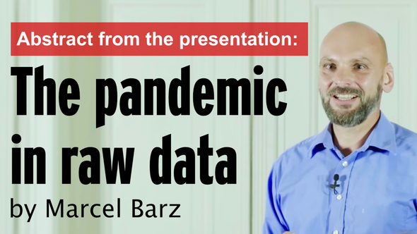
Hashtags:
Useage rights:
Standard-Kla.TV-Licence

 Deutsch-ID setzten

Trending on Kla.TV

![]()
24.02.2022 | www.kla.tv/21723
Marcel Barz, 46, business information scientist, former officer of the German Federal Armed Forces, lets numbers speak for themselves. Kla.TV recently broadcasted an unabridged version of his lecture: “The Pandemic in Raw Data”. Since the lecture is very detailed and long, Kla.TV is showing an abridged version with the most important facts today. At the beginning when the pandemic was proclaimed, Marcel Barz, like many of us, was initially very frightened. The threatening worldwide reports and images in the media made him afraid - afraid of illness, afraid of dying, afraid for his family, afraid for his children. In his circle of friends there was someone who saw the pandemic somewhat differently. Barz, who has always enjoyed working with numbers, wanted to prove to his friend that he was barking up the wrong tree and began to do some research. As a “bean counter”, as he calls himself, he determined and analyzed actual deaths, Intensive Care Unit bed occupancy and Corona-infected patients from 2020. Summary of the analysis on deaths: According to official statistics, there were higher numbers of deaths in 2020 than in 2019, which were attributed to Corona. First, Barz noted that when these figures were calculated, they did not take into account that 2020 was a leap year and that there was a demographic increase from 80 to 83 million citizens. After he added these important facts to the calculations and also took into account the different age groups, a different result emerged. Compared to earlier years, there was no increase in the number of deaths in any age group! Conclusion: The mortality figures for 2020 on the German federal government's website were clearly misrepresented. Summary of the analysis on Intensive Care Unit bed occupancy: In the next step, he reviewed the actual occupancy of intensive care beds by Covid patients. The German Interdisciplinary Association for Intensive Care and Emergency Medicine, or DIVI for short, publishes daily figures on available beds and their occupancy in hospitals. There, free beds, occupied beds, covid patients, deceased patients and departures are shown in daily rates and time series. Barz imported all these figures together into a table, taking into account other relevant data, e.g. municipality codes, in order to be able to present everything more clearly [Graph 33:13-46]. So the utilization in the intensive care units is on the rise or increases over the entire course of the pandemic. So, and that was the first – the first thought for me was, “Aha, here’s the pandemic.” But you know, in thinking through, we’re going to start with quality control, so we’re going to go in there now. So again, the question: how does a pea come into being and whether all the peas are in the pot or whether there might not be some rotten peas in there. In the process, he noticed contradictions. What is communicated to the public by the DIVI are not, as expected, the reports of the hospitals, but summaries based on charts. Here are two examples from his presentation: [Graph 35:14-53] So here, for example, I now have the deaths: Each day is a bar and the red, these are the total deaths in Germany. And the blue are the deaths reported by the intensive care units from the DIVI register. And there I see that some blue bars are chasing far beyond the red ones and that’s just not plausible. So there can’t have been more deaths in ICU than the total in Germany on that day. And above all, I then see correction reports that go into the negative. Or, second example, where Barz superimposed charts on reports and found inconsistencies in the Covid reports: [Graph 36:20-57] So the red curve, these are the Covid patients in the intensive care unit, which are therefore taken from the DIVI, and the blue are the Covid patients who are in the hospital – who are reported to the RKI. And the red curve is always subset of the blue curve, yes, because blue curve are all in hospital and red only those who are in ICU with Covid-19. And from the 16 calendar week, you can see this here: So the blue curve intersects the red curve and that’s just not plausible for the pea counter. So there can’t be more in ICU than there are in the hospital. These data are not plausible to him. In summary, Barz shows from his analyses that Covid patients did not burden ICUs more. Even DIVI staff were stunned when they were informed of this. Thus, the number of intensive care beds was unchanged and constantly low at 4 % in the last 15 months regarding Corona. It was noticeable, however, that from November 2020 onwards, many hospitals suddenly reported a higher occupancy rate. However, this was not due to more Covid patients, but to the fact that beds were reduced in the hospitals. But other circumstances also caused a falsified result, for example reports of multiple occupancy of patients who were transferred more often. Or patients who were admitted with completely different illnesses and then counted as Covid patients because of a positive Corona test. The conclusion for Barz as a "bean counter" is: “As good as the data from the DIVI intensive care register are, I cannot represent a pandemic here! So, I could, for example, by putting the percentage utilization at the top, show my friend Hartmut: Look here, how this has increased! But if I honestly look at the data with the toolbox I have as a “bean counter”, I have to say: These data do not help me to give evidence of a pandemic.” Summary of the analysis on Corona infected persons: What does the “bean counter” Barz now say about the infected figures or the incidence figures? As you have already guessed, the statistics do not provide valid [valid = legally valid] data here either. This is because it is not the people who are actually infected who are counted, but the people who test positive with the PCR test. As confirmed by the WHO and experts, a PCR test cannot provide reliable results. The test does not detect viable virus, so in the case of positive PCR tests it is not possible to determine whether an infection is actually present. Consequently, "incidence values" are not meaningful, as they do not show the percentage of positive and negative tests in the total number. The more Covid tests are performed, the more positive values are obtained [= higher incidence value]. Conclusion: Poor data from infected and non-infected persons cannot prove a pandemic. In all three of the cases mentioned, Barz was thus able to prove that the figures were either wrong, manipulated or not meaningful. His conclusion: he would never have imagined this result. If he had not felt compelled to do his own research by his dissenting friend, whom he had to agree with in the end, he would not have ended with a chandelier full of light but would continue being frightened in the dim glow of foggy candles. Through Barz’s correct and analytical understanding in dealing with numbers, frightening information, as steered by the political Corona agenda and propagated by the media, can be put into perspective and even dissolved. If you want to know more about the development of his investigations, including his experiences with the German Bundeswehr in the Kosovo war, where he draws parallels to today’s situation, you can find his entire lecture here on Kla.TV. [kla.tv/19889] (in German).
from wou/avr
www.kla.tv/19889